< Contents
3. Create data views
💡 After processing your data, you can create multiple data views to visualize your data effectively. Tablize offers various data views, including worksheets, bar/line charts, pivot tables (reports, line pivots, column pivots, pie pivots), data filters, and advanced views.
📖 This document will provide examples of how to create bar charts and line charts to help you quickly understand Tablize's data visualization capabilities.
Tablize has prepared sample data for you. You can click to download it here: Sample Data
Line Chart
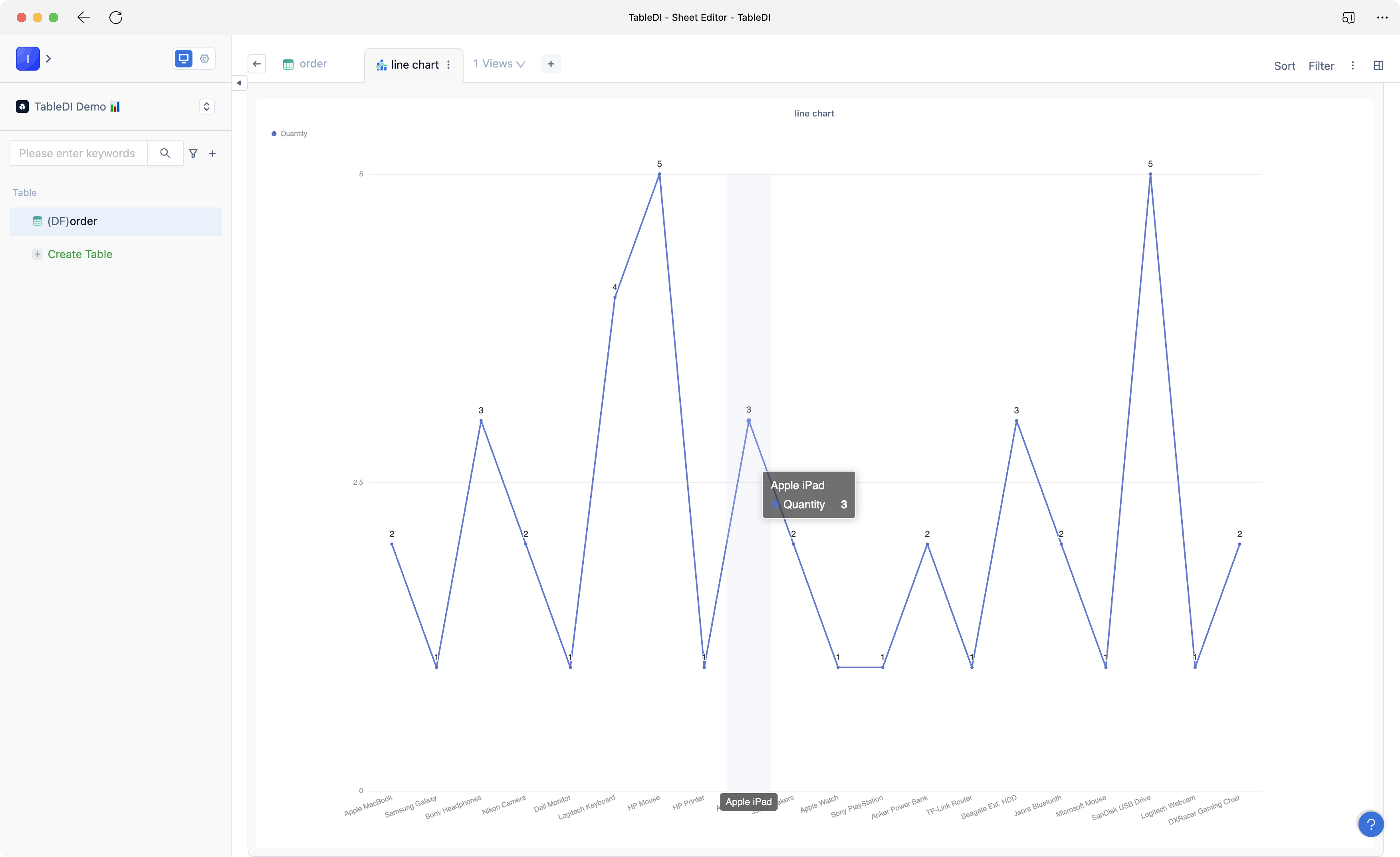
You can create a line chart for product sales quantity based on the order table.
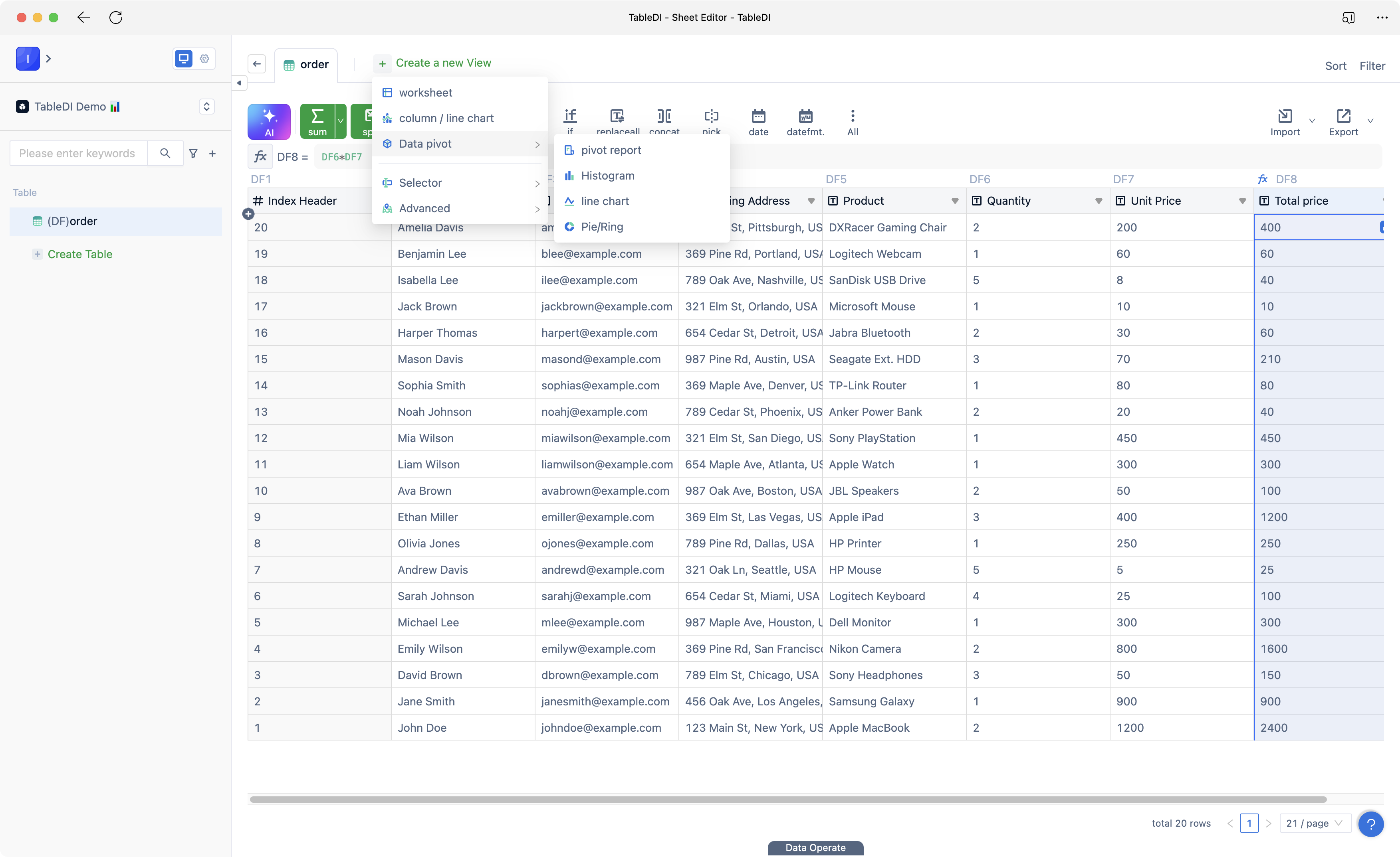
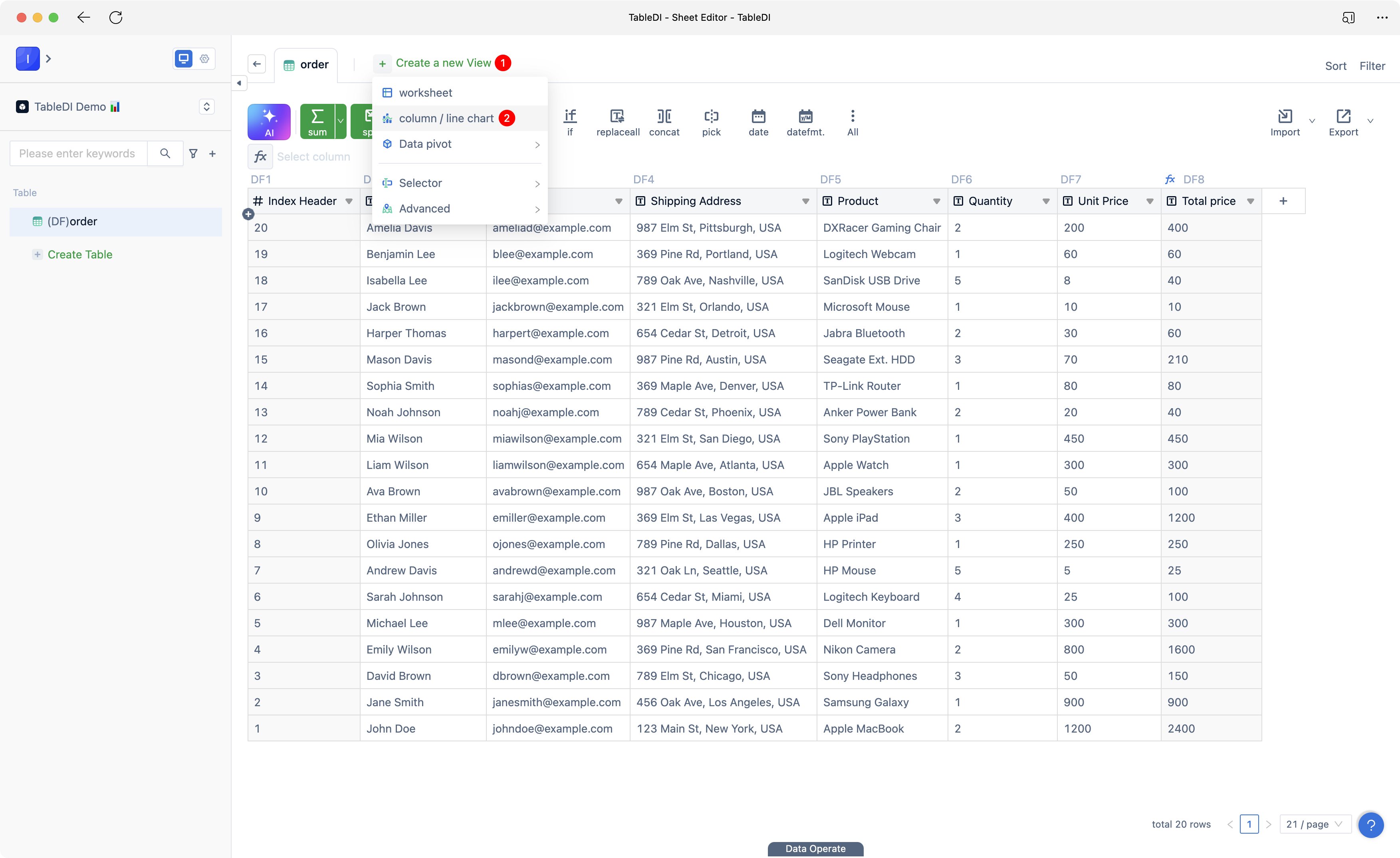
- Click "Create a new View" and select "Bar/Line Chart."
- In the data view editor, choose "Product (DF5)" for the X-axis and "Quantity (DF6)" for the Y-axis. Then click "Save."
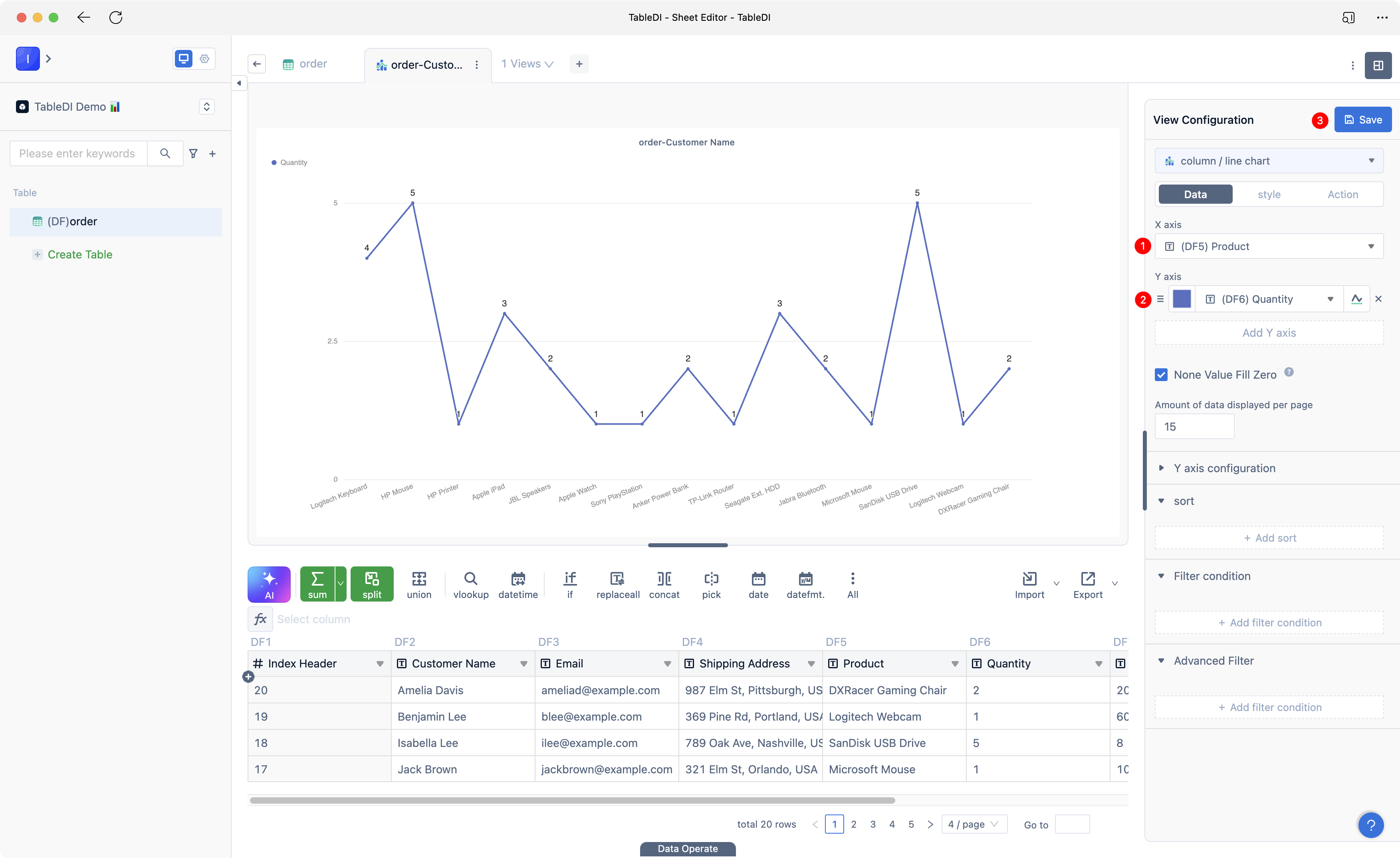
- Once completed, you will have a line chart data view like the one shown below.
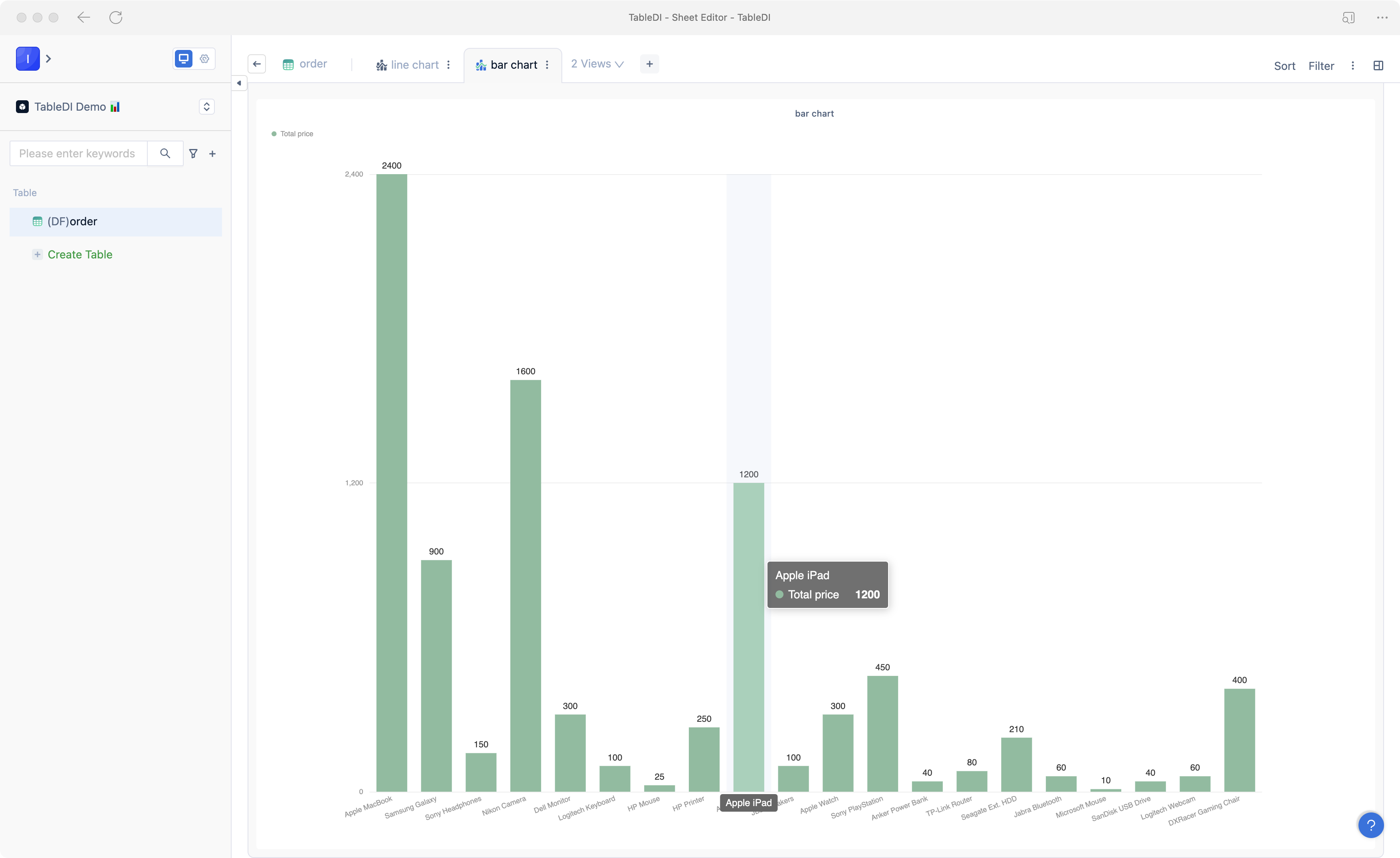
Bar Chart
You can create a bar chart for the total sales amount of products based on the order table.
- Click "Create a new View" and select "Bar/Line Chart."
- In the data view editor, choose "Product (DF5)" for the X-axis and "Total Amount (DF8)" for the Y-axis. Select green color and choose the bar chart presentation, then click "Save."
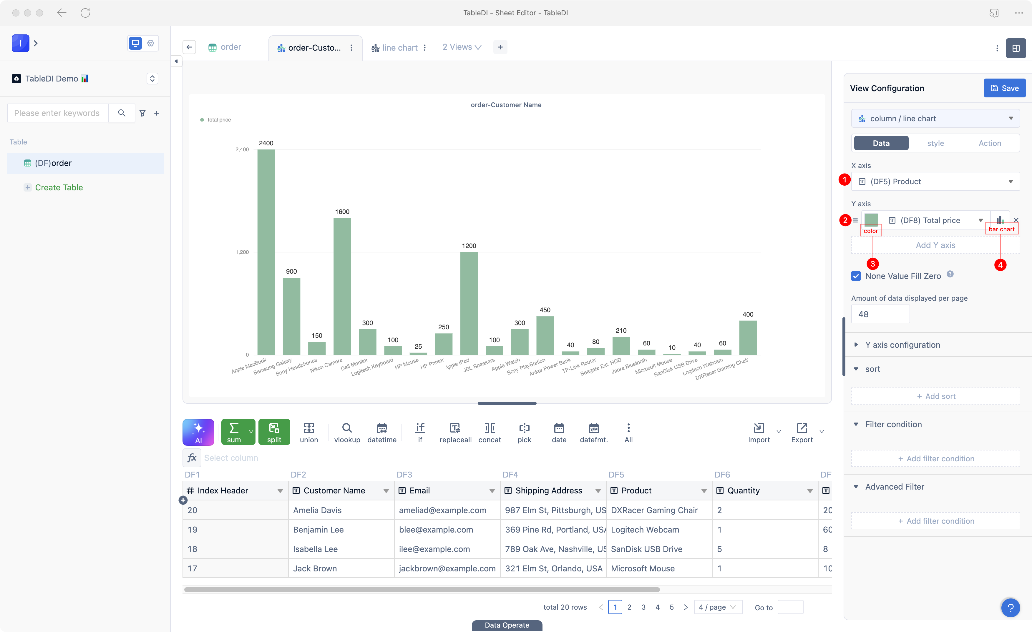
- Once completed, you will have a bar chart data view like the one shown below.